Note
Go to the end to download the full example code.
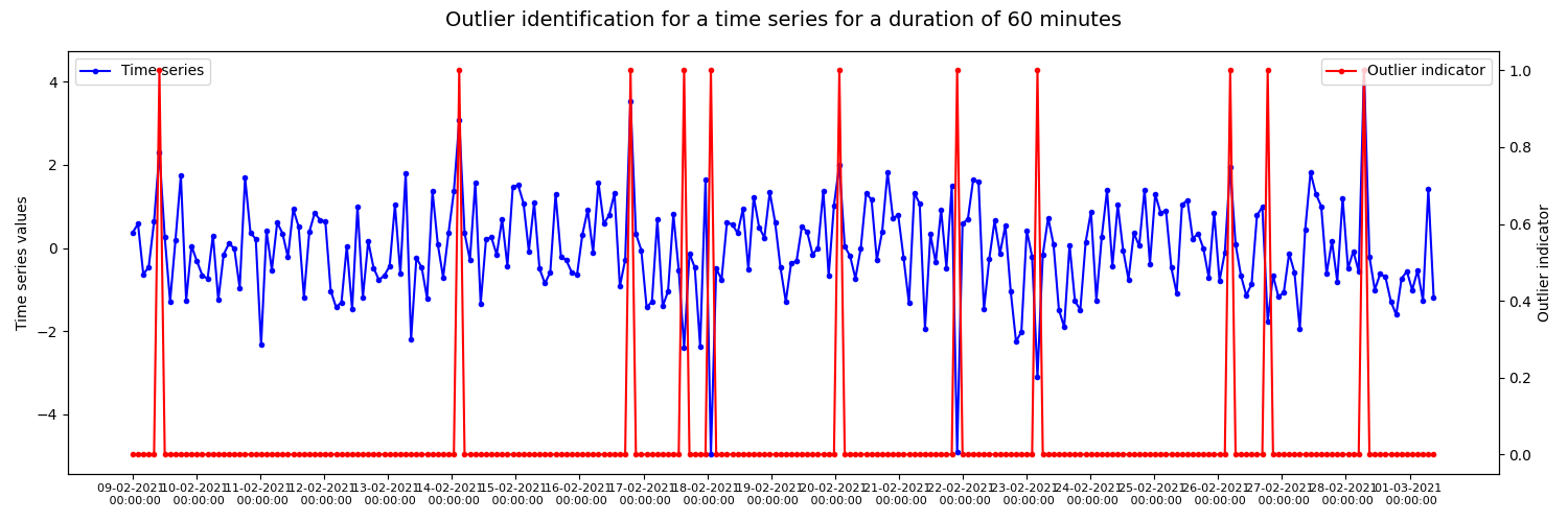
Outlier detection with DBSCAN and spline regression 001
Example of outlier detection in a randomly generated time series data using DBSCAN and spline regression. The resulting figure shows outlier indicator time series generated with a time window of 60min plotted on the original time series.
import matplotlib.pyplot as plt
import numpy as np
import pandas as pd

from indsl.statistics.outliers import detect_outliers


# Generate time series with outliers
rng1 = np.random.default_rng(0)

mu = 0
sigma = 1
outliers_positive = rng1.uniform(low=3 * sigma, high=5 * sigma, size=2)
outliers_negative = rng1.uniform(low=-5 * sigma, high=-3 * sigma, size=2)
values = np.concatenate((outliers_positive, outliers_negative, rng1.normal(mu, sigma, 240)), axis=0)

rng1.shuffle(values)

data = pd.Series(values, index=pd.date_range("2021-02-09 00:00:00", "2021-03-01 09:00:00", periods=244))


# Plot outliers against actual data
fig, ax1 = plt.subplots(figsize=(15, 5))

# Plot actual time series data
ax1.plot(data.index, data, label="Time series", marker=".", color="blue")

ts_values = pd.date_range(data.index[0], data.index[-1], freq="1D")

ax1.set_xticks(ts_values)
ax1.set_xticklabels([ts.strftime("%d-%m-%Y \n %H:%M:%S") for ts in ts_values], fontsize=8)

# Plot outliers indicator time series
ax2 = ax1.twinx()
ax2.plot(detect_outliers(data).index, detect_outliers(data).values, label="Outlier indicator", marker=".", color="red")

# Place legend
ax1.legend(loc="upper left")
ax2.legend(loc="upper right")

plt.xlabel("Timestamp")
ax1.set_ylabel("Time series values")
ax2.set_ylabel("Outlier indicator")

fig.suptitle("Outlier identification for a time series for a duration of 60 minutes", fontsize=14)
fig.tight_layout()
plt.show()
Total running time of the script: (0 minutes 0.225 seconds)